


Inside the Pack: O Border, Where Art Thou?
With this month’s release of Series 1, we entered the fifth year of full-bleed photography on the Topps flagship product. Beginning with its first baseball-only release in 1951, Topps included a border of some kind on each of its designs. These borders were overwhelmingly white, but at times incorporated other colors or patterns into the design. That all changed in 2016, when Topps ditched the border in favor of a photo that stretched to the edges for the first time. We haven’t gone back to full borders since then. That’s not a coincidence — it’s a pattern.
Why did Topps decide to eschew a tradition more than 60 years old and remove borders on its flagship line? They’ve never said, but I have my own theories. First, photography is so much better now, and we have a ready availability of action shots as opposed to the posed portraits of the 50s and 60s. Those better photos deserve more space on the card. If you’ve got a great photo of Aaron Judge leaping to make a catch at the outfield wall, as Topps included on its 2017 card of the Yankees star, why should you lose nearly an inch of real estate in each direction just to stick a border on it for tradition’s sake?
Topps also has a large online presence, both with on demand cards and digital trading cards. Borders make little to no sense on a digital card, such as one in the Topps Bunt app. Removing borders on its physical cards allows Topps to bring its digital offerings more in line with its physical ones.
What is interesting, however, is how Topps has been treating its borders (or lack thereof) over the past 5 years. While there isn’t a full border around the entire card, there is still a need to put a team logo, a player name, a position, and a team name on the front of the card. Topps has achieved this in a number of ways. In 2016 and 2017, the first two years without a full border, Topps included a “bottom border” of sorts, with the photo bleeding only to the top and side edges before fading into a border along the bottom edge that included the pertinent info.
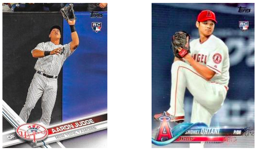
By 2018, Topps essentially had no borders, instead carrying the photograph to all 4 edges and including player and team info in a banner that was layered on top of the photo. I thought for sure that the future of Topps cards would look like this; it achieves the desire for full bleed photography while still allowing information to appear front and center. But 2018 was probably the worst year for parallels in Topps’s flagship product. While the previous bordered issues changed the color of the border to correspond to each parallel (such as gold, black, Independence Day, and so on), in 2018 the lack of border caused Topps to change the background instead. This was difficult to easily discern, and plenty of parallels got missed in the shuffle as they were mistaken for base cards.
So in 2019, Topps sort of reversed course. Instead of bringing back a single border, Topps added TWO borders — one along the bottom and one along the right side. The photo was now no longer a “full bleed” photo, as it only extended to two edges of the card. Parallels looked sharper, sure, but it was curious to have two borders on a card. I previously wrote at the time of release that there should either be borders or not. Something in between didn’t make a whole lot of sense.
It seems like this year, Topps figured it out. The 2020 design has a border along the right edge of the card. The difference is that with the exception of where the name is written, the border is translucent, meaning the photo shows through the border. This means that for the first time, the photo truly is full-bleed, extending to all 4 edges. It also means Topps was able to change the border color for base card parallels. Given the progression of the borderless designs the last five years, it appears that Topps played around with a lot of ways to achieve their desire for a large photo and minimally invasive border, and finally hit on one this year. I would be surprised if a single translucent border isn’t the new normal in flagship designs going forward.