
Inside the Pack: The 15 Best Vintage Topps Inserts, Ranked (#15-11)
Topps is known today for its standard baseball cards, but for many years in the 1950s and 1960s they issued a variety of non-standard (what we’d now call “oddball”) releases. These standalone issues were often not very popular, and are rare today as a result. But that’s a blog post for a different time. Starting today, we’re going to talk about the oddball series that are more prevalent, because Topps issued them with their standard card offerings. These were some of the early Topps insert sets.
Collectors today are accustomed to insert sets, though most of the time they are standard-sized cards that are simply about a different subject matter. These 1960s inserts were completely different sets. Over the next three weeks, I’ll offer my ranking of the top 15 vintage Topps insert sets, five at a time. Note that these rankings include only true insert sets — those that were inserted into standard packs — and not standalone products. As a result, some of my favorite sets, like 1964 Topps Stand-Ups, are absent from the set.
15. 1970/1971 Topps Scratch-Offs
These are grouped together even though they were issued in different years because, from the exterior, they look exactly the same. This insert was a bi-fold perforated piece of cardboard. Once unfolded, you could play a scratch-off game and keep score on the back of the card. Unfolding the card is also the only way to differentiate between the two years of issue — the 1970 issue has a white background around the black boxes, while the 1971 issue has a red background.
This set ranks low for me for a number of reasons. First and foremost, it’s fairly ugly, with the player’s picture and name taking less than half of one of the four panels; the rest is boilerplate that looks exactly the same from card to card. Additionally, a small setlist generally makes for a boring collection, and this set is no different, with just 24 subjects that are identical across both years. Although 9 Hall of Famers, led by Hank Aaron, dot the checklist, the issue came so late that it does not include Mickey Mantle or Sandy Koufax, who had both retired, nor does it include Roberto Clemente, Pete Rose, or Willie Mays. All five of these players generally drive the value of a set (along with Aaron), so their absence makes this set one of the least enticing insert sets.
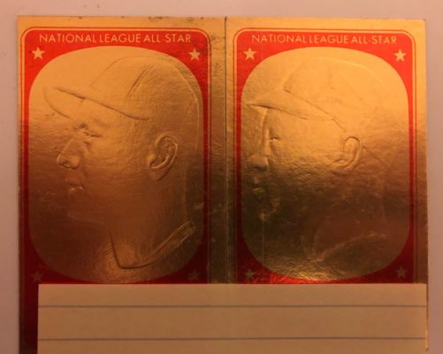
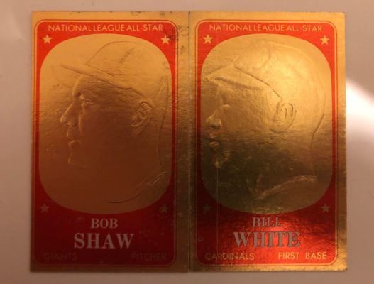
14. 1965 Topps Embossed
This set is so unique that it ought to be higher on the list, but so poorly executed that it ends up down here. The Embossed insert set contains bronze-colored profiles of players that evoke thoughts of a Hall of Fame plaque. The only problem is that the cards look nothing like the players they were supposed to resemble. The raised depictions on the card were easily damaged, so it isn’t uncommon to find these scratched or dented or smashed or otherwise mutilated.
The checklist, at 72 cards, is large, and almost everyone you’d like to see in the set is there, as Koufax, Mantle, Clemente, Mays, and Aaron are all there, along with a number of other Hall of Famers. But with backs that don’t contain any kind of information and fronts that have no resemblance to the subject, the appeal simply isn’t there: if you took Mickey Mantle’s profile and replaced it with John Romano’s, I don’t think anyone would notice, and that’s not ideal.
13. 1968 Topps Game
This is one of the more recognizable insert sets from the 1960s, and for good reason — they’re easy to come by and the checklist is loaded. At just 33 cards, you’d expect some omissions, but Mantle, Aaron, Clemente, Mays, and Rose all made the cut.
Many collectors love this set, though I suspect that may be because they played the game as children. I didn’t, so I have a few issues with it. Like my problem with the Scratch-Off sets, the only difference from card-to-card is the player’s photo and name (although on this release, the name isn’t typed out, but rather in the form of a facsimile signature). The variance of game moves, like “Single” and “Home Run”, mean nothing if you aren’t playing the game. The backs, like the Embossed issue, contain no information, with the same pattern on each. This is an affordable set to put together with some big names, but taken objectively, the set doesn’t pass the greatness test.
12. 1971 Topps Coins
Following a successful release of similar coins in 1964 (which is ranked higher on the list), Topps once again inserted metal coins into packs in 1971. Like everything in the 70s, these coins are colorful, with bronze, blue, and gold rims and green and red interiors. The backs of the coins vary from series to series: gold in the first series, silver in the second, and blue in the third and final. These backs contain a small amount of personal information about the player.
The checklist is large, at 153. Clemente, Aaron, Rose, and Mays are the big names here, with other Hall of Famers like Gibson and Bench present as well. Overall, however, the checklist is weaker than its 1964 counterpart, and it’s straightforward as well — a lack of variations means there’s a little less fun in putting together a set.
11. 1967 Topps All-Star Pin Ups (Posters)
The success of these inserts led to a standalone poster release the following year. Truthfully, these posters are beautiful, as the 5″ x 7″ inserts have full-color photos, a name and position, and a facsimile signature. In a perfect world, these rank much higher on my list.
The checklist is strong, with 16 of the 32 subjects being Hall of Famers, including Mantle, Clemente, Mays, and Aaron. (Though somehow, even at just 32 subjects, the checklist found room for Bobby Knoop.) The biggest issue I have with the set is not in the checklist, and not in the design, but in the nature of the set itself: because these were large posters, they were folded several times to fit in the packs. And as such, creases, and rips along those crease lines, are very common. The paper used was also a kind of newsprint, so over time most posters have yellowed and smell like old newspaper.
Now, as for the answer to the Topps Embossed question: you thought you knew, didn’t you? But really…
See? I told you the players didn’t look like their subjects!