Inside the Pack: 2020 Topps Flagship Design Revealed
Earlier this month, Topps released the design and details for its flagship 2020 product, due out on February 5th. When the design for 2019 was released around this time last year, I wrote that the design had a few puzzling elements, primarily a gigantic last name that appeared above the player’s first name, and a two-sided border after years of working to remove borders. Topps has rectified both of those things with its attractive 2020 design, leaving collectors nothing to do but wait with excitement for February.
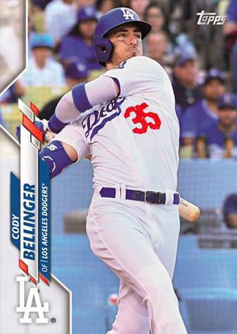
First, let’s address the fixes Topps made to the items I didn’t care for last year. Rather than a two-sided decorative border, the 2020 design will have just one side with a design for the player’s name, team name, colors, and logo. While I do think the border is a little thick for what’s there, it leaves plenty of room for a full-bleed action shot, much in the way the 2016, 2017, and 2018 designs did. It’s easy to see, too, how this border will lend itself to various Topps color parallels, like gold/pink/blue/black borders, as well as Topps Chrome color refractors.
Topps has also stopped listing player names like players were on a class roster, with their last names first. A significantly larger last name has been done before, like on 2007 Topps, but the huge last name before the first name was unsettling for the 2019 design. In the 2020 design, the last name is still larger, but actually appears as a last name. Another great improvement.
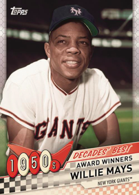
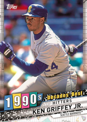
There were also more details released about insert set designs and the overall theme of the product. This year’s theme — since neither Topps nor Major League Baseball has an anniversary to celebrate — is “Celebration of the Decades.” This manifests itself in multiple ways throughout the product. The first is the Decades’ Best insert set which, on first glance, might be my favorite insert set in recent memory. The design template is consistent across the decades, but each decade has its own style — for example, the 1950s cards look like a 50s drive-in, with a checkered background and fast-food-sign-style 1950s symbol, while the 1990s cards have an animal print background and bright colors. Each decade between the 1950s and 2010s will have a top 10 list, making this an expansive set to put together on a whole, or a simple set to build for a single decade.
Decade of Dominance is a die-cut insert set that will showcase players who led the league in certain categories for a decade. After all this looking backward, Topps pivots to the future with Decades Next, a focus on young stars bound to make big splashes in the 2020s.
In keeping with a recent theme, Topps will celebrate the 35th anniversary of the 1985 Topps set in a number of ways. Inserts of stars from today and the past on the 1985 design will be included, along with autos and relics featuring the design. Silver packs will also return with Chrome-style 1985 design cards. A major change to the silver pack program is that the packs will be inserted directly into the boxes, rather than given to dealers to distribute. This will prevent dealers who sell silver packs separately, or online dealers who sell boxes without the silver packs.
In addition to all of these exciting insert sets, standard Topps fare such as Major League Materials and manufactured commemorative relics will also return in 2020.
All this information leaves me with just one question: can it please be February already?


