
Inside the Pack: Topps Heritage Enters the 70s
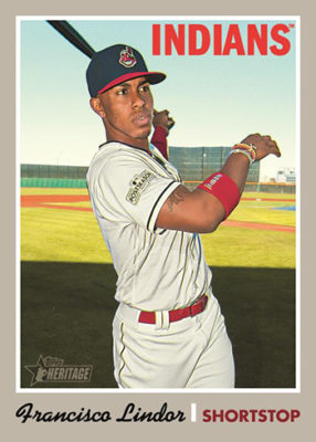
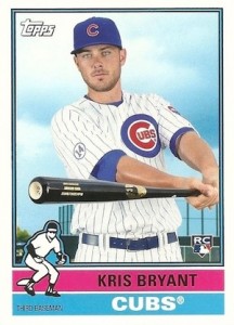
Last week, Topps released mock ups for its 2019 Topps Heritage set. And while I knew it was coming, I was still kind of shocked by what I saw: a design based on cards from 1970. To be clear, I have no issues with the 1970 set, and the design looks very nice and sleek. The inserts, true to form, are pulled from 1970 as well. They include Scratch Offs, Topps Super, Topps Poster, and Topps Teammates. The Topps Mint card, featured at the top of this post, is also very likely the sharpest design I have seen for this subset.
As I have stated several times, the 1971 set is my favorite set of all time. I absolutely cannot wait until 2020 Topps Heritage is released, so that I can collect the 1971 design. The problem is that there are a lot of uninspiring Topps Heritage releases in the offing.
After 1972 Topps, set design gets pretty boring. 1973 is perhaps the most acceptable design thereafter: simple, but still elegant. I don’t think I will hate the Heritage cards for that year when they are released in 2022, but I’m not exactly looking forward to them. Sure, there’s the funky design of 1975 Topps, which is so bad you kind of have to love it, but I’m not sure how I feel about card design that loud on a modern release.
The problem is really the other years: all the other designs from the decade are downright horrible.
Go ahead, picture a 1974 Topps card; any car that pops into mind from that set. I’ll wait.
I’m willing to guess that if you were even able to picture a card, it’s either the Dave Winfield rookie card or another “Washington Nat’l” error card. These are the only redeeming qualities of a set otherwise completely bland and devoid of any interest. The only way I think I’d dig this release is if the popular Heritage High Number release has cards that evoke the 1974 Topps Traded set, with a giant yellow TRADED banner.
From there, until you hit the end of the decade at 1980, the other sets from the latter half of the 70s are equally as boring. Plain white border, team name, player name. Okay, maybe the designers at Topps got fancy with a position flag in 1977 or a colored bar at the bottom in 1979. But these designs are boring and you know it.
I do look forward to seeing the 1980 design on Heritage cards 10 years from now, and the rest of the early to mid-80s designs have enough redeeming qualities that they will be fun to see (plus, some of them have already been used in Topps Archives products, with great success).
Once you get to the late 80s, the nostalgia of the height of the card market will carry the designs. Seeing my future children collect future Hall of Famer Vladimir Guerrero Jr. on the 1987 design in the year 2036 will be a thrill for me. But as far as I’m concerned, enjoy Topps Heritage for the next couple of years. After that will be half a decade of rehashing the most boring and uninspiring designs card collectors have had to deal with.