
Inside the Pack: The 15 Best Vintage Topps Inserts, Ranked (#5-1)
For the last two weeks, we’ve been counting down my list of the top 15 vintage Topps insert sets (you can find #15-11 here and #10-6 here). Today I’ll reveal my list of the top 5. As a reminder, the rankings include only true insert sets — those that were inserted into standard packs — and not standalone products. As a result, some of my favorite sets, like 1964 Topps Stand-Ups, are absent from the set.
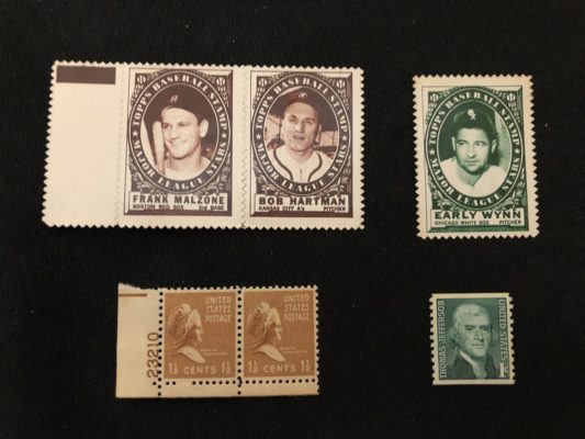
5. 1961 Topps Stamps
Last week, the follow-up Stamps issue from 1962 ranked #9, and although you might think it’s strange to have two similar releases with similar checklists separated in the rankings, there are several reasons the 1961 version ranks higher for me. First of all, the design of the 1962 is, as noted last week, colorful and bright, with full-color photos on bold yellow or red backgrounds. That’s great, but this is the 1960s we’re talking about, and actual stamps just didn’t look like that. As a former stamp collector myself, the 1961 issue always reminded me of an actual vintage postage stamp, which I think is an awesome touch. The monotone green or brown color of the stamp reminds me of the stamps I collected as a child, and just gives a much classier look to the set than the bright backgrounds of the 1962 issue.
The checklist of individual stamps is actually a little larger at 208 unique stamps, but the panel checklist is smaller at 182 panels. Interestingly, there are only 207 different players, but Al Kaline got the honor of having both a brown and a green stamp. These stamps are also a little less common than the 1962 issue, and hard to find in top condition: earlier this year, a PSA 10 Mickey Mantle sold for $4,560.
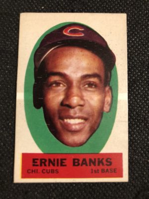
4. 1961 Topps Magic Rub-Offs
This set is one that’s both fun and infuriating to collect, but always awesome to look at. First, the fun: unlike future similar issues, such as the 1965 Topps Transfer and 1966 Topps Rub Offs sets (more on those issues soon), the Magic Rub-Offs are full of color and goofiness. The set is half team pennants, half players; the pennants aren’t simple pennants, but rather have a cartoon scene invoking the team name, and the players are given fun nicknames to go along with their oversized cartoon heads.
Now, the infuriating: the checklist, tiny at just 36 items, kind of stinks. Each of the 18 teams at the time were given one pennant and one player. This results in the lone Hall of Famers being Yogi Berra and Ernie Banks. The nicknames are kind of annoying too, as some players are given nicknames that don’t belong to them; for example, Frank Howard, known as “Hondo,” is given the nickname “Tower” on his card. It’s also extremely difficult to find these in nice shape, as the wax-paper-like material frequently gets crinkled.
3. 1966 Topps Rub-Offs
The 1966 version of Rub-Offs — which were suddenly no longer “magic” — gets a nod over the 1961 issue for several reasons. Like the 1961 issue, each of the 20 teams has a pennant, and the pennants in this issue are admittedly not as interesting or fun as the 1961 version. However, the real photo portraits of players is much preferred over the goofy caricatures from 1961. There are also way more players, at 100, which makes for a more robust checklist that includes Mickey Mantle, Roberto Clemente, Willie Mays, Sandy Koufax, and so on. The material is also significantly more durable; these are still frequently found creased, but not as badly or extremely as the 1961 issue.
That said, Topps apparently did not care much about centering for this issue. In fact, I’m fairly certain that I’ve seen as many card with parts of 2 players on it as I have a standard card with just one player on it. But that’s part of what makes this a fun set to collect — chasing a fairly-well-centered copy of all 120 items on the checklist.
2. 1965 Topps Transfers
This set is the perfect happy medium between the 1961 and 1966 Topps Rub-Offs. Like the 1966 issue, it’s a slightly more durable material, intended to be ironed on rather than scratched off. Rather than a caricature like 1961 or a portrait like 1966, players are represented by a cartoonified outline sketch that very much resembles each player. Centering is an issue, but not as badly as 1966. The only color on these comes from the blue (American League) and red (National League) bars on the top and bottom, but the pictures are so unique and fun to look at that it really doesn’t matter.
While the checklist is strong with the standard 1960s Hall of Famers (Mantle, Clemente, Aaron, Mays, et al), there’s also some fun in the checklist. Carl Yastrzemski and Bob Veale are both considered short prints. Additionally, it was not until 2010 that a variation was discovered: Ron Hunt is listed alternatively at 2nd Base or at Shortstop. This issue is more difficult to find than the less-than-stellar 1965 Topps Embossed set, which was issued in earlier series packs, so the Transfers set pops up less frequently. It’s a very fun and satisfying set to put together.
1. 1963 Topps Peel-Offs
There could be another 15 insert sets and the Peel-Offs would still rank #1 for me. They have everything going for them: color, unique design, variations, and difficulty finding in high grade condition. Of every Topps issue, both main and insert, this one most accurately represents the era it was from: the bright colors and floating heads evoke memories of the Andy Warhol-esque pop art that was gaining in popularity at the time.
The subjects aren’t just any Joe Shlabotnik that Topps could find: the checklist is impressive, with 18 of the 46 subjects being future Hall of Famers. Even more fun is putting together a set with all the variations: some, but not all, of the players have two variations, with blank back and instruction back versions (people in the 1960s needed instructions on how to peel the backing off of a sticker). Because of the intent to peel and stick these, they’re difficult to find in nice shape, and collecting all the variations could be a chore. It’s well worth it, though — this is, after all, the best vintage insert set that Topps ever made!*
(*according to me)